


![]() Happy Disability Pride Month
Happy Disability Pride Month
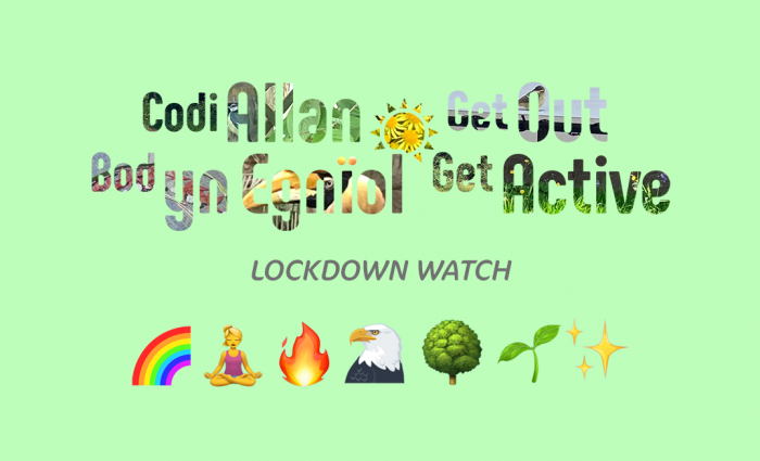
Our GOGA alternative to BBC's Springwatch is here!
All week we will be bringing you a variety of videos that will encourage you to get outdoors, get active and get involved in your garden at home... see all of the videos over on our YouTube channel: https://bit.ly/dswyt
From all of us here at DSW, we hope that you are all staying safe, healthy and active at home. A huge thank you to the NHS for all your hard work so far and thank you to all those who are volunteering in such uncertain times #StaySafe

Disability Sport Wales is able to influence, include and inspire in sport with the support of our fantastic partners.

SPAR UK (AF Blakemore Ltd.)


The Cynnig Cymraeg (Welsh Offer) is the official recognition of the Welsh Language Commissioner and is given to organisations that have supported the Commissioner’s long-term plan to ensure people can use the Welsh language in all aspects of their lives, in all parts of Wales. Disability Sport Wales was awarded this certification in June 2024. Read more about our Cynnig Cymraeg (Welsh Offer).


These options options adjust the visual layout of disabilitysportwales.com. If you are using a screen reader, these options will not change your experience, and you may wish to close this Accessibility Options panel and continue browsing the site.
Select an option:
Select an option:
Please select your preference:
You may optionally select to view this website in Lato or Atkinson Hyperlegible.
Please select your preference:
You can choose to minimise the use of capital letters for headings and sub-headings if you find them easier to read in Sentence Case. Some text, including acronyms, may still be shown in capital letters.
Please select your preference:
This site sometimes uses animation to bring the content to life. If you'd like to disable this, you can do.
Please select your preference: