


![]() Happy Disability Pride Month
Happy Disability Pride Month
 Typography
Use of fonts, text layouts and text sizes and their effect on accessibility.
San Serif fonts like Arial, Helvetica, or Verdana offer greater legibility than serif fonts like Times New Roman, Garamond or Georgia.
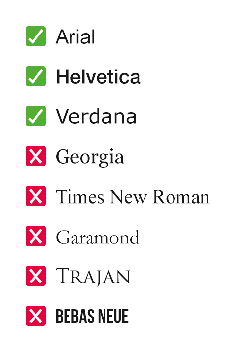
Using all UPPERCASE LETTERS, and therefore fonts that do not include lowercase letterforms such as Trajan or Bebas Neue should be avoided wherever possible. This is particularly important for text set over multiple lines.
Aside from acronyms, informational text (that is, text that is not purely decorative), should not be set in UPPERCASE if you want your text to be accessible. UPPERCASE has its stylistic benefits; it’s punchy, powerful, and strong. If you need to leverage these characteristics to help convey a message, try to use UPPERCASE only:
Tracking (the spacing between letters) and leading (the spacing between lines of text) should be adjusted with careful consideration. Tracking and leading that is too tight or too open drastically decreases legibility.
Leading that is too tight can cause crashing (when two lines of text touch or overlap each other), and leading that is too open makes lines feel disconnected, disrupting reading flow.
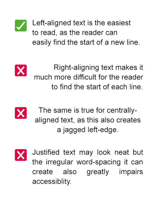
When text is set over two lines or more, for best accessibility you should:
12pt should be a minimum for paragraphs of text. 14pt is better, so is ideal when possible, and should be treated as minimum for Easy Read documents.
Create a clear hierarchy by generously enlarging headings and subheadings.
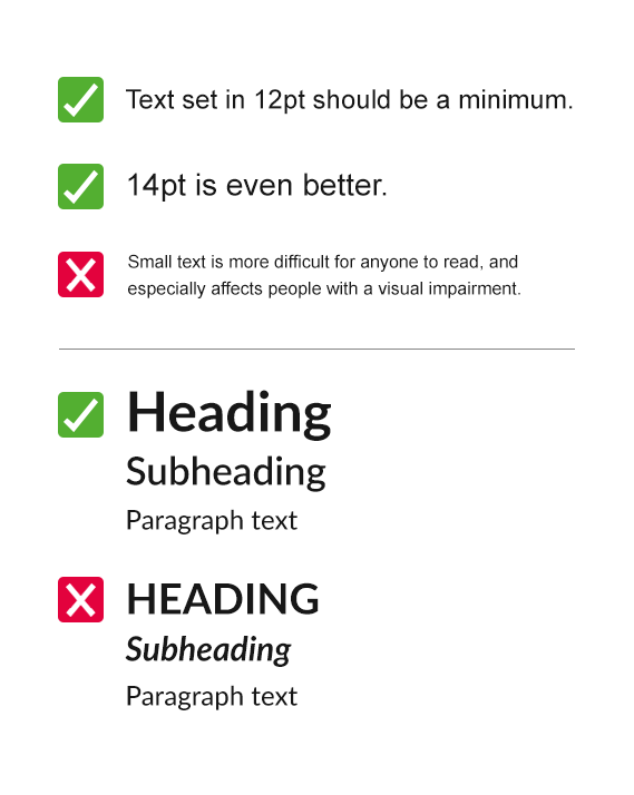
Using bold text, or adjusting scale is preferred over using italics or underlined text when you want to create emphasis.
Bold and enlarged text maintain or increase legibility, where italics and underlining can impair it.
If you're interested in booking places on a Guidance for Inclusive Marketing Workshop, please contact Disability Sport Wales' Education and Training Officer, Mary FitzMeilton (contact details below)

Disability Sport Wales is able to influence, include and inspire in sport with the support of our fantastic partners.

SPAR UK (AF Blakemore Ltd.)


The Cynnig Cymraeg (Welsh Offer) is the official recognition of the Welsh Language Commissioner and is given to organisations that have supported the Commissioner’s long-term plan to ensure people can use the Welsh language in all aspects of their lives, in all parts of Wales. Disability Sport Wales was awarded this certification in June 2024. Read more about our Cynnig Cymraeg (Welsh Offer).


These options options adjust the visual layout of disabilitysportwales.com. If you are using a screen reader, these options will not change your experience, and you may wish to close this Accessibility Options panel and continue browsing the site.
Select an option:
Select an option:
Please select your preference:
You may optionally select to view this website in Lato or Atkinson Hyperlegible.
Please select your preference:
You can choose to minimise the use of capital letters for headings and sub-headings if you find them easier to read in Sentence Case. Some text, including acronyms, may still be shown in capital letters.
Please select your preference:
This site sometimes uses animation to bring the content to life. If you'd like to disable this, you can do.
Please select your preference: